Sample Notification Inbox Module- iOS
The Notification Inbox sample module is an easy-to-use plug-and-play solution created by WebEngage to help the client integrate a Notification Inbox within their application without having to build it from scratch. This module provides lots of flexibility and customization to help clients in giving the Inbox a look and feel similar to their app.
After Integrating this module clients will be able to send copy of their push notification campaigns within their App Inbox.
Please NoteIntegrating this module isn't a pre-requisite for enabling Copy to Inbox feature. Clients with their self created Notification Inbox will be able to send copy of their push notifications as well.
Integration of WebEngage iOS Notification Inbox Module
Follow the steps below to integrate the WebEngage iOS Notification Inbox Module into your project:
Step 1: Clone the Code
Go to the WebEngage iOS Notification Inbox Module GitHub repository and clone the code to your local machine.
Step 2: Copy the Module
Copy or import the WENotificationInboxModule module from the cloned code into your project.
Adding WebEngage's Notification-inbox-module
Add the below lines of code to initialize the Notification Inbox from wherever you want, i.e. On click of a button.
import WENotificationInbox
...
..
let storyBoard: UIStoryboard = UIStoryboard(name: "WENotificationInbox", bundle: nil)
let inboxViewController = storyBoard.instantiateViewController(withIdentifier: "WENotificationInbox") as! WENotificationInboxViewController
self.navigationController?.pushViewController(inboxViewController, animated: true)
#import "<Project_Name>-Swift.h"
...
..
UIStoryboard *storyboard = [UIStoryboard storyboardWithName:@"WENotificationInbox" bundle:nil];
WENotificationInboxViewController *inboxViewController = [storyboard instantiateViewControllerWithIdentifier:@"WENotificationInbox"];
[self.navigationController pushViewController:inboxViewController animated:YES];And that's it you will be able to see all the notifications.
CongratulationsYou have now successfully integrated our Notification Sample Module.
Get Notification Count
To retrieve the updated notification count of unread messages, add the following code snippet to your viewWillAppear method of your view controller.
 WENotificationInbox.shared.getUserNotificationCount { [weak self] data, error   in
            if data != nil{
                // Attach result string to your Notification Bell Label
                }
            }else if let weInboxError = error{
            // Handle the error
            }
        }
[WENotificationInbox.shared getUserNotificationCountWithCompletion:^(id _Nullable data, WEInboxError * _Nullable error) {
__weak typeof(self) weakSelf = self;
if (data != nil) {
// Attach result string to your Notification Bell Label
} else if (error != nil) {
// Handle the error
}
}];Adding Customization to Default Cards
You can customize the card by creating a class and conforming that class to our Protocols based on your requirements.
| Protocol Name | Description |
|---|---|
WEViewControllerConfigurationProtocol | For customization related to viewController, navigationBar, and tableView. |
WEPushTextConfigurationProtocol | For customization related to the TEXT cards. |
WEPushBannerConfigurationProtocol | For customization related to the BANNER cards. |
Each Protocol has a set of properties, for which you can provide custom values.
class CustomConfiguration: <WEPushTextConfigurationProtocol>{
    var titleFontColor: UIColor = .systemPink
    var titleFont: String = "AmericanTypewriter"
    var titleFontSize: CGFloat = 16
    var descriptionFontSize: CGFloat = 18
    var timeFontColor: UIColor = .red
    var timeFont: String = "AmericanTypewriter"
    var timeFormat: String = "EEEE, MMM d, yyyy"
    var timeFontSize: CGFloat = 14
}
  @IBAction func notificationButtonClick(_ sender: Any) {
    // Add the below code as per your application
    let storyBoard: UIStoryboard = UIStoryboard(name: "WENotificationInbox", bundle: nil)
    let inboxViewController = storyBoard.instantiateViewController(withIdentifier: "WENotificationInbox") as! WENotificationInboxViewController

    // Call the setupCustomConfiguration and pass the CustomConfiguration object and for what you need the customization.
    // customizationFor should be one of ("text", "banner", "viewController")
    inboxViewController.setupCustomConfiguration(customConfiguration: CustomConfiguration(), customizationFor: "text")

    self.navigationController?.pushViewController(inboxViewController, animated: true)
}
// The custom Class should conform to any oof the WE Protocols.
@interface CustomClass : NSObject <WEPushCardConfigutationProtocol>
@end
//Implementation of the CustomClass
@implementation CustomClass
//The properties you want to modify.
@synthesize cardBackgroundColor = cardBackgroundColor;
@synthesize cornerRadius = cornerRadius;
@end
.
.
.
.
- (IBAction)notificationInboxButton:(id)sender {
// This code will initilize the Notification Inbox Module
UIStoryboard *storyboard = [UIStoryboard storyboardWithName:@"WENotificationInbox" bundle:nil];
WENotificationInboxViewController *inboxViewController = [storyboard instantiateViewControllerWithIdentifier:@"WENotificationInbox"];
===== You can add the customization code here =====
CustomClass *myObject = [[CustomClass alloc] init];
customConfig myConfig = customConfigText;
[inboxViewController setupCustomConfigurationWithCustomConfiguration:myObject customizationFor:myConfig];
[self.navigationController pushViewController:inboxViewController animated:YES];
}
Multiple CustomizationsYou can add multiple customizations by calling the
setupCustomConfigurationmethod multiple times.
Default Notification Layouts
Following are details for each layout:
Text Layout
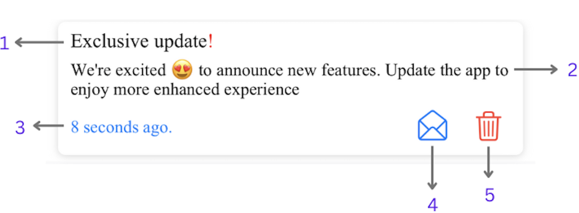
| Reference No. | WEPushTextConfigurationProtocol | Description |
|---|---|---|
| 1 | titleFont: String | to change the Title font |
titleFontSize: CGFloat | to change the Title font size | |
titleFontColor: UIColor | to change the Title font color | |
| 2 | descriptionFont: String | to change the Description font |
descriptionFontSize: CGFloat | to change the Description font size | |
descriptionFontColor: UIColor | to change the Description font color | |
| 3 | timeFont: String | to change the Time font |
timeFontSize: CGFloat | to change the Time font size | |
timeFontColor: UIColor | to change the Time font color | |
timeFormat: String | to change the Time format (pass any time format support by Swift) | |
| 4 | readButtonImage: UIImage | to change the Read Button Image |
readButtonImageTintColor: UIColor | to change the Read Button tint color | |
unReadButtonImage: UIImage | to change Unread Button Image | |
unReadButtonImageTintColor: UIColor | to change the Unread Button tint color | |
readUnreadButtonVisibility: Bool | to hide/unhide the read/unread button | |
| 5 | deleteButtonImage: UIImage | to change the Delete Button Image |
deleteButtonImageTintColor: UIColor | to change the Delete Button tint color | |
deleteButtonVisibility: Bool | to hide/unhide the delete button |
Banner Layout
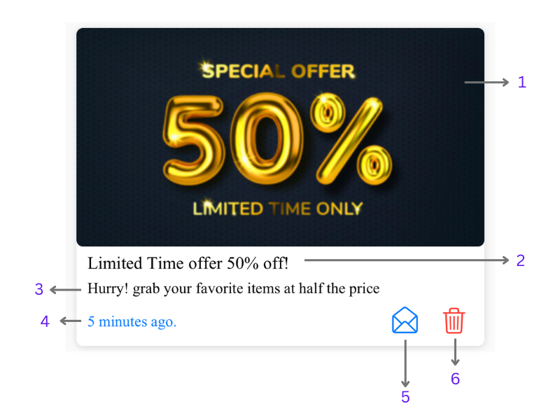
| Reference No. | WEPushTextConfigurationProtocol | Description |
|---|---|---|
| 1 | imageViewCornerRadius: CGFloat | to update the corner radius of image(by default it will take up the cards radius) |
imageViewContentMode: UIView.ContentMode | to change the image’s content mode. | |
| 2 | titleFont: String | to change the Title font |
titleFontSize: CGFloat | to change the Title font size | |
titleFontColor: UIColor | to change the Title font color | |
| 3 | descriptionFont: String | to change the Description font |
descriptionFontSize: CGFloat | to change the Description font size | |
descriptionFontColor: UIColor | to change the Description font color | |
| 4 | timeFont: String | to change the Time font |
timeFontSize: CGFloat | to change the Time font size | |
timeFontColor: UIColor | to change the Time font color | |
timeFormat: String | to change the Time format (pass any time format support by Swift) | |
| 5 | readButtonImage: UIImage | to change the Read Button Image |
readButtonImageTintColor: UIColor | to change the Read Button tint color | |
unReadButtonImage: UIImage | to change Unread Button Image | |
unReadButtonImageTintColor: UIColor | to change the Unread Button tint color | |
readUnreadButtonVisibility: Bool | to hide/unhide the read/unread button | |
| 6 | deleteButtonImage: UIImage | to change the Delete Button Image |
deleteButtonImageTintColor: UIColor | to change the Delete Button tint color | |
deleteButtonVisibility: Bool | to hide/unhide the delete button |
View Controller Layout
| WEViewControllerConfigurationProtocol | Description |
|---|---|
backgroundColor: UIColor | to change the background color of viewController |
navigationBarColor: UIColor | to change the navigation bar color |
navigationBarTintColor: UIColor | to change the tint color of the navigation bar |
navigationTitle: String | to change the title of the navigation bar |
navigationTitleColor: UIColor | to change the title color of the navigation bar |
noNotificationsView: UIView | you can show a custom view when there is no notification |
optionMenuImage: UIImage | to change the option menu(barButtonItem) Image |
optionMenuTitles: [String] | you can add custom titles to menu items (only the title can be updated, the functionality will remain the same.) |
Common Properties
| Property Name | Description |
|---|---|
cardBackgroundColor: UIColor | to change the card background color |
cornerRadius: CGFloat | to change the card corner radius |
shadowColor : UIColor | to change the card shadow color |
shadow0ffSetWidth : Int | to change the shadow width |
shadow0ffSetHeight : Int | to change the shadow height |
shadowOpacity : Float | to change the shadow opacity |
Keep in Mind
- Common properties will be available in WEPushTextConfigurationProtocol and WEPushBannerConfigurationProtocol.
- Properties in WEPushTextConfigurationProtocol will be available WEPushBannerConfigurationProtocol.
Please NoteWebEngage supports four types of push notification layouts: banner, text, carousel, and rating. However, the current version of the notification-inbox-module only supports text and banner layouts. If your application receives notifications with carousel or rating layouts, they will be displayed as text layouts by default, which can be overridden by your own custom layouts.
Adding Custom Cards
RememberBefore customizing the default layouts in the WebEngage Notification Inbox Module, it's important to be aware of the default layout properties that can be modified. Below are the default layout’s properties
In cases where you want to use your custom cards, you can create a Custom Cell.
- The custom cell must confirm to
UITableViewCellandWECustomCellProtocol. - Use the setupCell() from the
WECustomCellProtocolto add the data to your cell. - You need to register the cell with our
WENotificationInboxViewControllerobject. - Add an identifier to the Nib from one of these (“
TEXT", "BANNER", "RATING", "CAROUSEL"). - Call the
setupCustomCell(customCell: CustomCell(), forCellType: .text)and pass your CustomCell() object.
  let storyBoard: UIStoryboard = UIStoryboard(name: "WENotificationInbox", bundle: nil)
  let inboxViewController = storyBoard.instantiateViewController(withIdentifier: "WENotificationInbox") as! WENotificationInboxViewController

  //Loads the view controller’s view if it’s not loaded yet so that we can register the cell
  inboxViewController.loadViewIfNeeded()

  //Add in custom cells
  let nib = UINib(nibName: "TEXT", bundle: nil)
  inboxViewController.tableView?.register(nib, forCellReuseIdentifier: CellType.text.stringValue)
  inboxViewController.setupCustomCell(customCell: CustomCell(), forCellType: .text)

  self.navigationController?.pushViewController(inboxViewController, animated: true)
  UIStoryboard *storyboard = [UIStoryboard storyboardWithName:@"WENotificationInbox" bundle:nil];
  WENotificationInboxViewController *inboxViewController = [storyboard instantiateViewControllerWithIdentifier:@"WENotificationInbox"];

  //Getting the String value from Enum
  CellType myEnumValue = CellTypeText;
  NSString *reusableIdentifier = [CellTypeHelper stringValueForEnumValue:myEnumValue];

  //Loads the view controller’s view if it’s not loaded yet so that we can register the cell
  [inboxViewController loadViewIfNeeded];

  UINib *nib = [UINib nibWithNibName:@"TEXT" bundle:nil];
  [inboxViewController.tableView registerNib:nib forCellReuseIdentifier: reusableIdentifier];
  [inboxViewController setupCustomCellWithCustomCell:[[<CustomCellClass> alloc] init] forCellType:CellTypeText];
The value of
forCellReuseIdentifiermust be one of these depending upon the cellType
CellType.text.stringValue
CellType.banner.stringValue
CellType.rating.stringValue
CellType.carousel.stringValue
CellType.text.stringValue
CellType.banner.stringValue
CellType.rating.stringValue
CellType.carousel.stringValueUpdated 9 months ago